


 by Toripony » Tue Jun 14, 2011 6:07 pm
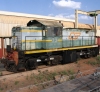
 Is great to see that in blue and gold, though that blue looks too too pure in my mind. Back in those days, the blue on these had a smokey component to it.... something toward a grayish blue... sort of like a faint campfire smoke but a tad darker... almost hazy as if you could strip it off you'd find the blue you have there hiding underneath. They looked grayer on the shady side, bluer on the sunny side.
by styckx » Tue Jun 14, 2011 6:25 pm
 After I posted that I went and started the weathering and shading to try to give it that "on the road" look. (dynamic shroud not touched in this SS)

by styckx » Tue Jun 14, 2011 9:16 pm

by styckx » Wed Jun 15, 2011 4:21 pm

by BNSF650 » Wed Jun 15, 2011 4:23 pm


by styckx » Wed Jun 15, 2011 7:50 pm


by Chessie8638 » Wed Jun 15, 2011 8:14 pm
by styckx » Wed Jun 15, 2011 8:17 pm
by BNSF650 » Wed Jun 15, 2011 9:09 pm
by qrfan3 » Wed Jun 15, 2011 10:52 pm
by ATSF3814 » Wed Jun 15, 2011 10:57 pm

by Toripony » Wed Jun 15, 2011 11:53 pm
Return to Rolling-Stock Design
Users browsing this forum: No registered users and 9 guests
 Great work on the classic C&O